45 IT Icons for Clear, Modern Digital Design
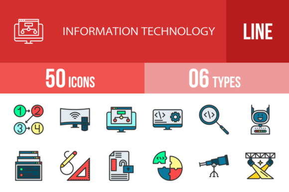
In the fast-paced world of digital design, clarity and speed are everything. You need visual elements that communicate instantly, work seamlessly across platforms, and look professional without requiring a design degree. That's exactly where a robust icon set like the 45 Information Technology Filled Icons comes into play. This isn't just a random collection of symbols; it's a carefully crafted toolkit designed for real-world application, from mobile app interfaces to corporate presentations.
Designed for Maximum Usability and Consistency
What immediately stands out about this collection is its foundation in the unigrid system. This isn't just a technical detail—it's a practical guarantee of visual harmony. Every icon, from the intricate Flowchart to the simple Power Button, shares the same geometric backbone. This consistency is crucial for maintaining a professional brand identity across all your design assets. When you use the Security Settings icon next to the Database Settings icon, they feel like siblings, not strangers. This built-in cohesion saves you hours of adjustment and ensures your layouts look intentional and polished.
The set includes two distinct styles: the solid, weighty filled icons and their more airy, outlined counterparts. This duality is a strategic advantage. The filled versions, with their bold presence, are perfect for grabbing attention in app navigation bars, key website features, or printed materials where you need immediate recognition. The line icons offer a lighter touch, ideal for secondary actions, detailed infographics, or contexts where you want to avoid visual clutter. Having both styles at your fingertips gives you nuanced control over your project's visual hierarchy.
Practical Applications Across Every Platform
Think about the last time you needed to illustrate a complex tech concept. How do you visualize API connectivity or Digital Commerce quickly? This icon set provides immediate answers. For a mobile app developer, icons like Holding Smartphone, Smartphone Shake, and Add to Basket are ready-made solutions for onboarding flows and key features. A web designer building a SaaS dashboard can leverage Web Page Statistics, Sitemap, and Location Settings to create intuitive navigation that users understand at a glance.
Beyond the screen, the value extends into print and presentation. A marketing agency preparing a client pitch on cybersecurity can use Locked System, Insecure Code, and Warning Sign to build a compelling visual narrative. An entrepreneur creating product packaging for a new gadget can incorporate Bluetooth Connectivity or Battery Indicator to communicate features without lengthy explanations. The icons are 100% vector, meaning they scale perfectly from a tiny favicon to a massive trade show banner without losing a pixel of sharpness. The inclusion of 20 PNG sizes means you have a ready-to-use file for virtually any context, from social media graphics to high-resolution print.
Enhancing Communication and Professionalism
Using a cohesive icon library like this does more than just decorate your project—it fundamentally improves communication. A well-placed Search from Code icon in a developer's blog post instantly clarifies the topic. A Female Profile symbol in a user interface feels inclusive and modern. This visual shorthand reduces cognitive load for your audience, making your content more accessible and engaging. It's a subtle form of modern typography applied to symbols, where every shape carries meaning.
For small businesses and creators, the impact on brand perception is significant. Consistent, professional icons signal that you pay attention to detail and value user experience. Whether you're a blogger using Articles and Email Address icons in your newsletter template, or a crafter incorporating Drawing Tools into a digital pattern, these assets elevate your work from amateur to polished. They act as a universal visual language, helping you connect with a diverse audience of designers, entrepreneurs, marketers, and hobbyists alike.
Choosing and Implementing Your Icons
When integrating these icons, consider your project's overall tone. The filled style has a bold, contemporary feel that pairs well with clean sans-serif fonts in web design or logo design for tech startups. The line icons can complement more detailed editorial design or packaging design where you need to maintain a lighter aesthetic. Always test your chosen icons at the intended display size. A complex icon like Hello World Program might lose detail at 16×16 pixels, while a simpler one like Television remains clear.
Remember, these are design assets, not just pictures. Use them to guide the eye, break up text, and reinforce key messages. Place the Spotlight icon next to a featured product. Use the Flowchart to diagram a process in a presentation. The goal is to make information easier to digest, not to add decoration for its own sake. With formats like AI, EPS, and SVG, you have full control to edit colors, modify shapes, and truly make the icons your own, ensuring they integrate perfectly into your unique brand identity.